
Top 10 Logo Lanyard Designs to Elevate Your Brand
2026-11-16
Let’s be honest: most logo lanyards are forgettable. They either blend into a sea of black straps or shout with generic printing that cheapens your brand. But the right design—thoughtful color, material, and logo placement—can turn a practical accessory into a quiet sales pitch. In this post, we skip the filler and walk through ten logo lanyard designs that actually elevate how people perceive your brand. Whether you need something crisp for a trade show or durable for daily staff use, each idea is meant to inspire, not overwhelm. And if you’re ready to produce lanyards that feel as polished as your brand, DONGCHUANG brings that precision to life without the usual production guesswork.
Minimal Lanyards That Let Your Logo Speak Softly
Most lanyards try to be billboards. These don’t. A slim, tightly woven strap in a single muted tone leaves almost no visual noise—just a small debossed or tonal stitch of your logo resting near the clip. It reads less like branding and more like a deliberate detail.
The restraint carries through every hardware choice. Matte or color-matched swivel hooks, low-profile safety breaks, and ends that are heat-sealed rather than capped with bulky metal keep the whole piece feeling intentional. Your logo doesn’t compete with shiny plastic or oversized text; it simply sits there, confident and quiet.
That quietness works especially well in settings where subtlety signals taste—design studios, private events, boutique offices. Attendees end up noticing the lanyard’s feel and finish before they even register the logo, which means when they do see it, the impression lands with more weight.
Sustainable Materials That Make Your Brand Hard to Forget
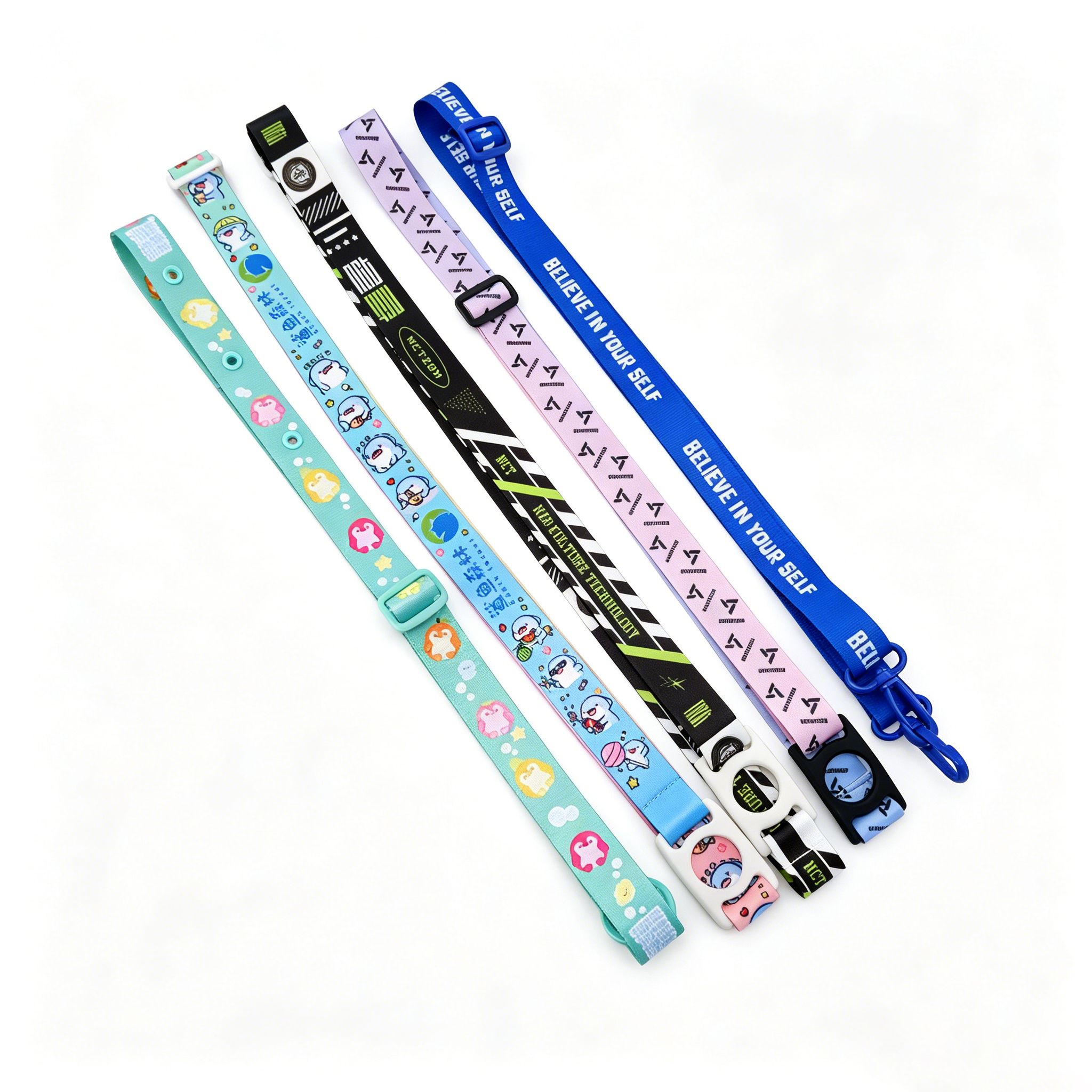
Walk into any trade show and you'll see a sea of identical giveaways—plastic pens, generic tote bags, and stress balls that end up in a drawer. Sustainable materials offer a way out of that noise. A notebook cover made from reclaimed ocean plastic or a lanyard woven from recycled cotton doesn't just sit on a desk; it starts conversations. People notice when an object feels different in their hands—slightly textured, faintly imperfect, carrying a story that mass-produced items can't tell. That tactile difference lodges your brand in memory far longer than a logo stamped on a shiny trinket.
The real power comes from letting the material speak before your logo does. Cork, bamboo fiber, upcycled leather offcuts, even mycelium-based packaging—each has a grain, a weight, a warmth that off-the-shelf plastics lack. When a customer receives a keychain made from recycled fishing nets, they don't just see your name; they feel the ridges where a rope once strained. That sensory detail turns a functional object into a keepsake. And unlike a flashy ad, this impression doesn't fade in seconds. It gets carried around, used, shown to friends, embedded in daily routines.
Most brands treat eco-friendly materials as a box to tick—swap one material, change a label, move on. But sustainability that sticks requires curation. Don't choose bamboo because it's trendy; choose it because its matte finish and natural striations echo your brand's understated precision. Don't wrap everything in Kraft paper and call it a day. The goal is coherence: the material, the message, and the moment of unboxing should feel like one deliberate gesture. Do that, and your brand stops being a logo people recognize. It becomes a texture they remember.
Color Pairings That Speed Up Brand Recognition
The brain processes color faster than text, so a pairing with sharp contrast becomes a visual shortcut. Red and yellow, for example, don't just sit side by side—they vibrate, making the combination hard to ignore and even harder to forget.
Unusual pairings, like teal and coral, can do more than trademarked logos. When used consistently, the two colors act as a quiet signal: you see that specific blend and the brand name surfaces before you read a single word.
Real-world testing beats color theory every time. A pairing that pops on packaging may wash out on a phone screen. Adjusting the ratio—one dominant hue, one carefully placed accent—lets the brand stay recognizable across any medium without shouting.
Lanyards Built for Long Days and Busy Events
Event days rarely go as planned, so the last thing you want is a lanyard that digs into your neck or frays before lunch. We use a tight, low-friction weave that keeps its shape through heat, rain, and the occasional coffee spill. The metal swivel hook is reinforced where it meets the strap, because that's the first point of failure on cheaper versions. After a 10-hour shift, it still lies flat instead of twisting into a cord.
For trade shows and multi-day conferences, the cotton-poly blend holds prints and badges without fading, even with constant handling. The quick-release buckle sits below the collar, so you can detach a badge or keys without pulling the whole strap over your head. It's a small detail, but when you're juggling a booth, a phone, and a stack of brochures, it saves the back of your neck from unnecessary friction.
Woven Textures and Contrast Stitches That Frame Your Logo
The fabric around the logo has a pronounced woven grain, almost like a tightly packed canvas. Light breaks across those ridges instead of flattening out, so the mark appears to sit inside the material rather than on top of it. That physical texture also gives the logo a subtle grip, something you notice when your thumb passes over the chest or sleeve.
A narrow band of contrast stitching follows the outer edge, set in a thread that is a half-step away from the base color. The passes are short and even, tight enough to stay sharp through repeated washing. This stitched frame does the quiet work of holding the eye on the logo while keeping the surrounding fabric from feeling plain.
Because the border is sewn rather than printed, it carries a faint raised profile. That slight elevation separates it from flat embroidery and gives the whole design a more deliberate, finished look, even from a distance.
Extra Hardware That Turns a Simple Strap into a Conversation Starter
A plain strap does its job, but add the right hardware and suddenly it tells a story. Think of a brushed brass buckle with an unexpected angular cut, or a magnetic clasp that snaps shut with a satisfying click. These aren't just functional bits—they're the first thing people notice. A chunky D-ring in gunmetal can shift a bag from office-ready to off-duty, while a hand-hammered copper rivet adds a touch of artisanal warmth. The trick is choosing pieces that feel intentional, not just screwed on.
The real magic happens when hardware interacts with the strap material. A matte black carabiner against a natural leather strap creates contrast that draws the eye. Swap in a polished stainless steel slider and the same strap reads more streamlined. Some makers go further with quick-release clips that let you change straps in seconds—turning a single bag into a modular system. That kind of versatility becomes a talking point without any effort.
Don't underestimate small details like edge-painted keepers or a custom zipper pull. They signal care and originality. When someone asks where you got that strap, the answer isn't just a brand name—it's about the unexpected hardware choice. That's the difference between an accessory and a signature piece.
FAQ
A memorable design usually pairs a clean, readable logo with an unexpected element—like a subtle pattern in the background, a contrasting stitch color, or a textured weave that catches light. Avoid cramming too much text; one strong focal point beats three competing messages.
Polyester is the standard for affordability and vivid printing, but if you want a softer hand feel, choose a woven nylon or a bamboo fiber blend. For events with lots of movement, a thicker tubular polyester resists fraying and keeps its shape longer.
Start with your brand's primary color for the strap itself, then use a complementary shade for the text or logo outline. If your palette is mostly dark, a lighter border or safety break can add contrast without adding new colors. Test a few combinations under both indoor and outdoor lighting before committing.
Dye sublimation is hard to beat for full-color, edge-to-edge graphics because the ink becomes part of the fiber. For simple one- or two-color logos, screen printing offers a slightly raised, durable finish that stands out on textured materials.
Focus on small upgrades: a metal swivel hook instead of plastic, a safety breakaway that matches the strap color, or a subtle debossed logo on the buckle. These details signal quality immediately, even if the strap itself is standard polyester.
Absolutely. A lanyard attached to a hangtag can turn a simple product into a collectible, especially if the design includes a limited-edition pattern or seasonal artwork. Retail staff can also wear them as a quiet uniform element that reinforces the brand without shouting.
Try an offset placement where the logo sits near the clip instead of the middle, or run a diagonal watermark behind the main logo for depth. Another option is a continuous pattern that alternates the logo with a small icon or monogram, which feels more designed than a standard repeat.
Decide on a hierarchy before adding anything. Put the logo at eye level near the chest, then place the website or tagline lower, closer to the clip. Use a smaller font size and a thinner weight for secondary text, and consider a tonal or outline treatment so it recedes rather than competes.
Conclusion
Some of the smartest logo lanyards don't shout for attention. A minimal design with thin, tonal straps gives your mark enough room to breathe, which often makes it more noticeable in a crowd than loud patterns ever could. At the same time, materials matter just as much as visuals. Switching to recycled PET or organic cotton lanyards positions your brand as forward-thinking, and that kind of quiet responsibility is exactly what people remember after a trade show. When you add a deliberate color pairing—say, a brand primary against a warm neutral or a high-contrast accent—you speed up recognition from across a room without needing extra wording.
Durability turns a practical item into a brand asset, especially during long conference days where flimsy straps end up in the bin. Woven textures and contrast stitching do double duty here: they reinforce the edges while framing your logo with a sense of craftsmanship. For brands that want a little more presence, consider thoughtful hardware updates like matte black swivel hooks, split rings, or a slim buckle. These small additions make a simple strap feel intentional and give attendees a reason to keep wearing it after the event, which extends your reach far beyond the expo floor.
Contact Us
Contact Person: Bill Huang
Email: [email protected]
Tel/WhatsApp: 8613829102720
Website: https://www.dclanyard.com